For Anderson/Miller, the Chicago studio behind hotel interiors for leading brands and independents, we started with how the firm competes for its next forty years, then carried that position into a refined identity, a full brand roll out and a website that leads with the work.
Anderson/Miller has designed hospitality environments since 1982, from its first renovation standard for Hyatt to custom luxury interiors for hotel brands and independent hotels around the world. Its work is creative, relevant and timeless.
We started with how the firm should be seen by hotel brands, owners and operators, then gave the identity the same qualities: a wordmark that pairs a classic serif with a confident sans, joined by a single fine line, and a system that reads as precisely in print as it does online.
Wordmark · Monogram · Color
Two names, one line.
Anderson in a light serif and Miller in a firm sans, joined by a fine vertical stroke that also forms the AM monogram. Navy and soft white keep the palette as calm as the firm's interiors.
Business Cards · Letterhead · Envelopes · Stickers · Notepads
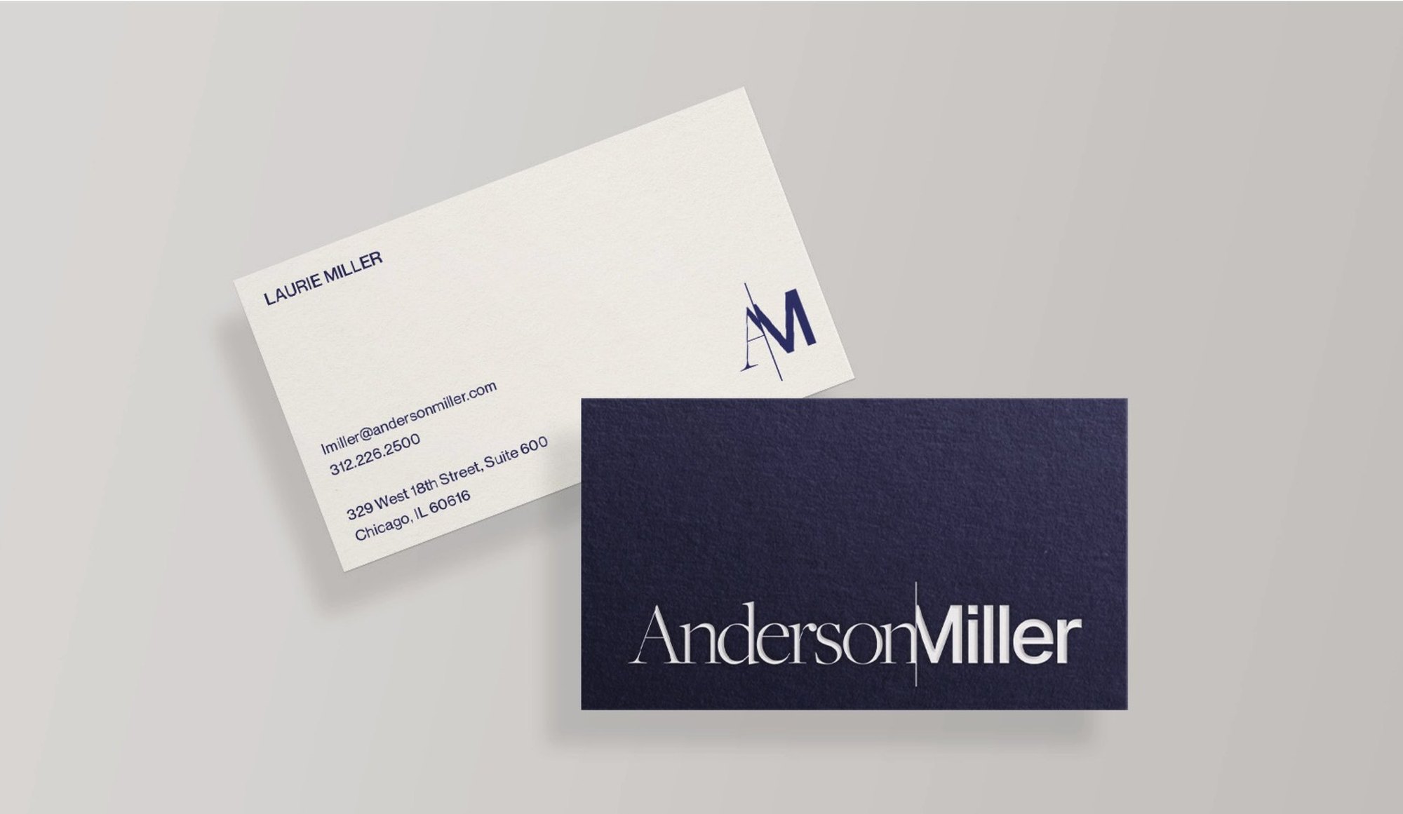
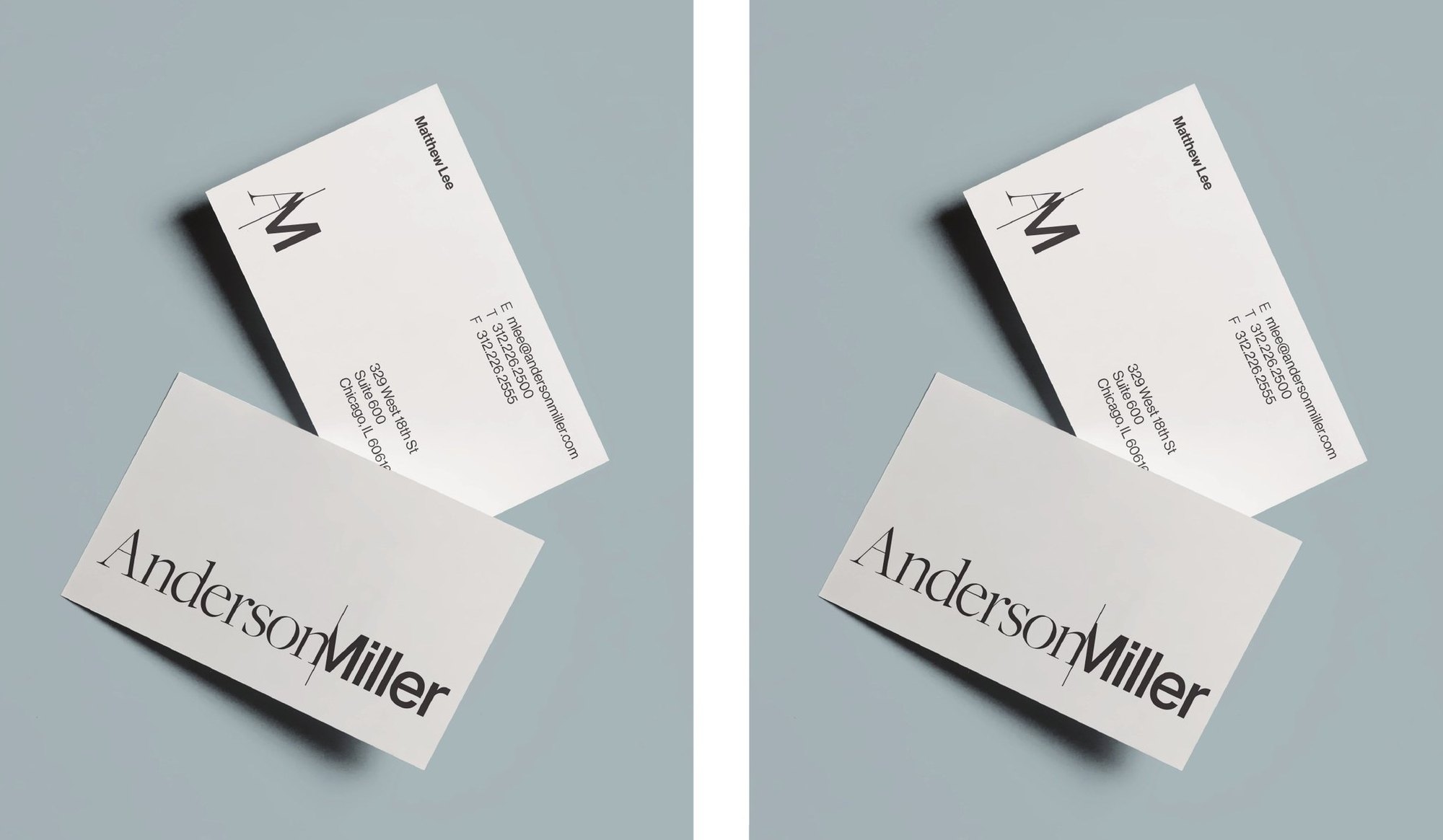
Foil on navy, printed on pale grey.
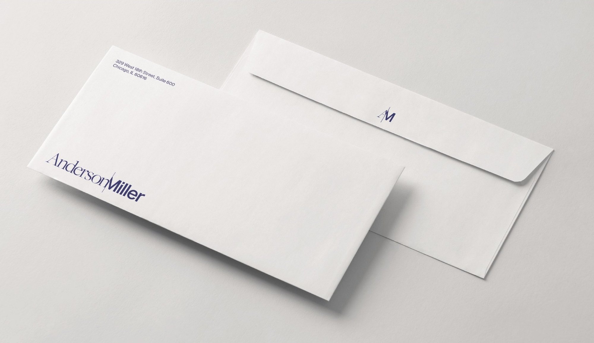
Business cards with a foil-stamped logo on navy paper, letterhead, envelopes lined in AML Blue, sample stickers for material boards, notepads and notecards, all laid out to the same grid.
Web Design · Project Index · Digital
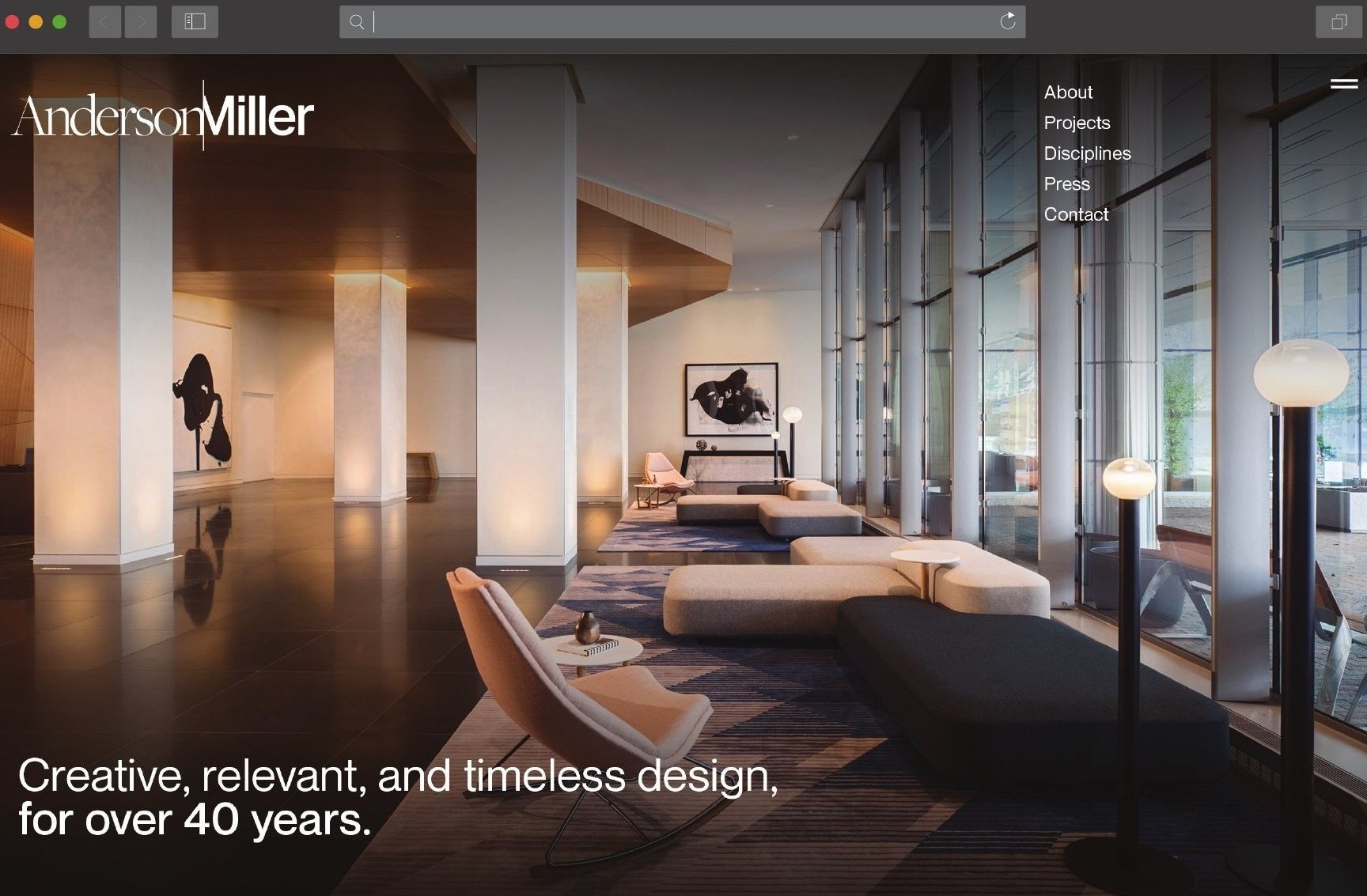
Creative, relevant and timeless design, for over forty years.
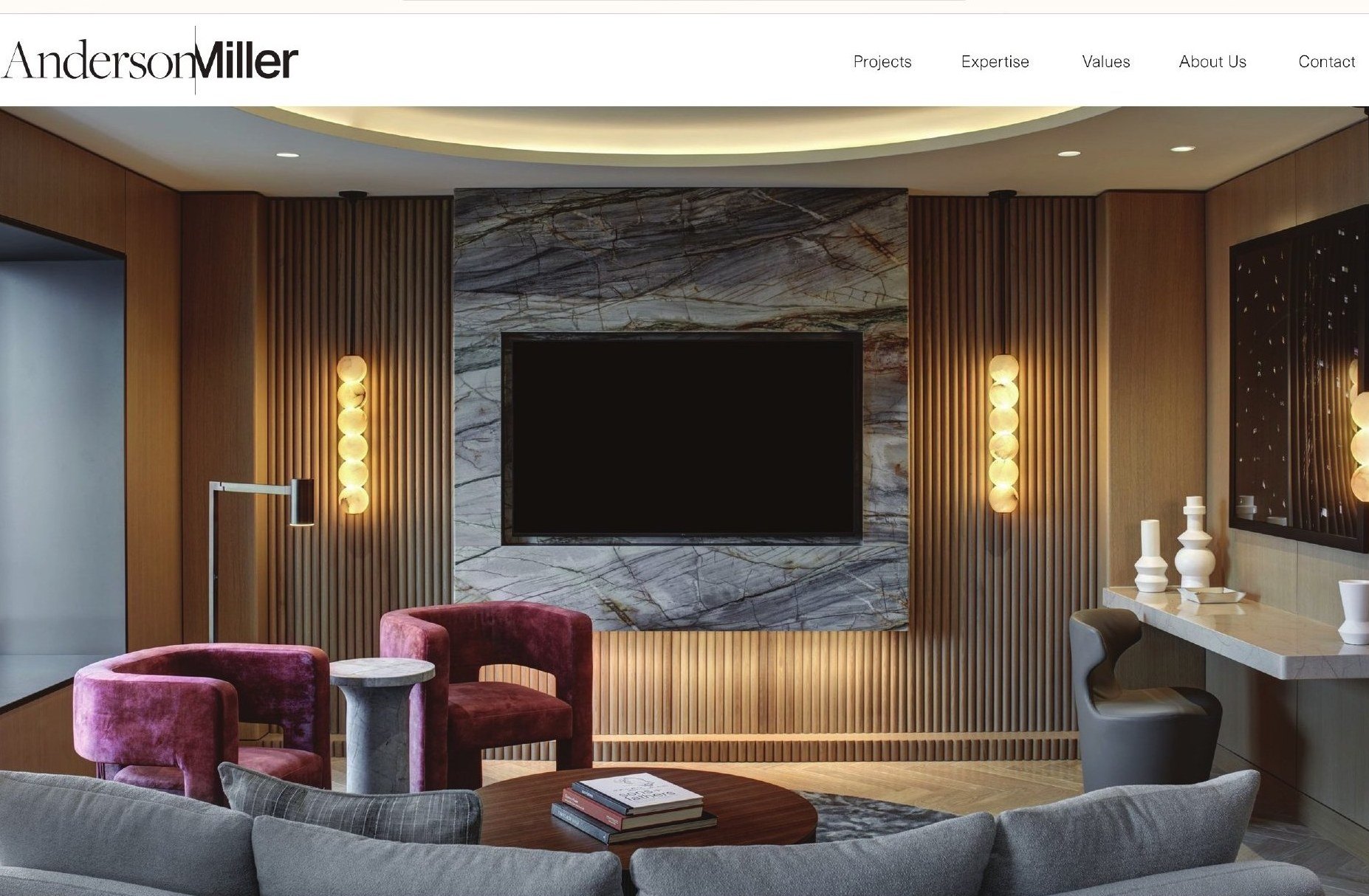
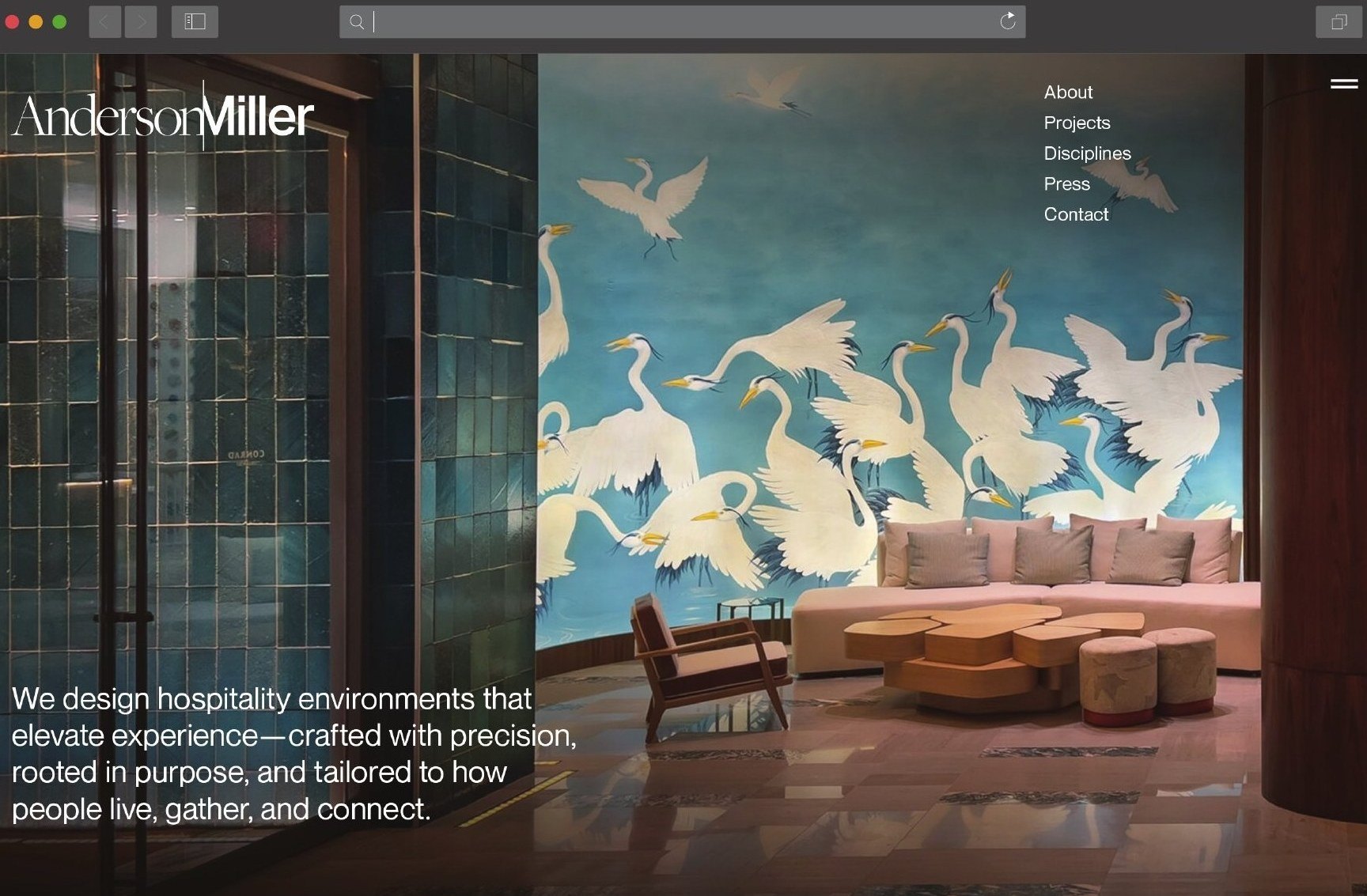
The new site leads with full-bleed photography of the work, a filterable project index and project pages made for quick reading, so the interiors speak first.
Social · Presentations · Print
One identity across every touchpoint.
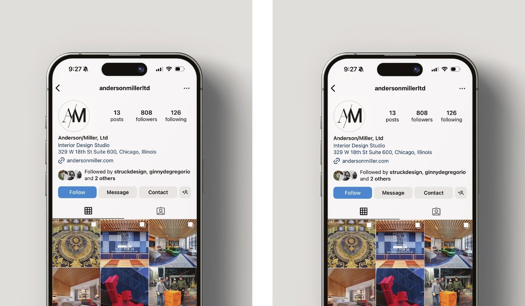
The horizontal logo carries into Instagram, presentations and printed books, keeping the firm recognizable wherever clients and partners meet it.
Portfolio · Photography
Tailored to how people live, gather and connect.
Each project gets room to breathe, with large images, concise facts and a clear path to the next hotel.
Creative, relevant and timeless.
The repositioning gives Anderson/Miller a clearer place in its market and a brand as precise as the environments it designs, opening a path to growth with hotel brands, owners and operators for the next forty years.